Navigation element and navbar
Navigation element and navbar
- One of the most notable aspects of Bootstrap web pages is the navbar. Navbars are meta components that function as navigation headers for your app or website. In mobile views, navbars collapse and become horizontal as the viewport width rises. The navbar's key features are site name style and basic navigation.
- Default Navigation Bar
- Add the classes.navbar,.navbar-default to the tag to make a default navbar.
- To aid accessibility, add role = "navigation" to the above element.
- Add the.navbar-header header class to the element. Include a navbar-brand-classed element. The text will be slightly larger as a result of this.
Simply add an unordered list with the classes.nav,.navbar-nav to the navbar to add links.
This is demonstrated in the following example.−
<div class="container">
<nav class = "navbar navbar-default" role = "navigation">
<div class = "navbar-header">
<a class = "navbar-brand" href = "#">knowledge 2life</a>
</div>
<div>
<ul class = "nav navbar-nav">
<li class = "active"><a href = "#">iOS</a></li>
<li><a href = "#">python</a></li>
<li class = "dropdown">
<a href = "#" class = "dropdown-toggle" data-toggle = "dropdown">
Java
<b class = "caret"></b>
</a>
<ul class = "dropdown-menu">
<li><a href = "#">jmeter</a></li>
<li><a href = "#">EJB</a></li>
<li><a href = "#">Jasper Report</a></li>
<li class = "divider"></li>
<li><a href = "#">Separated link</a></li>
</ul>
</li>
</ul>
</div>
</nav>
</div>
OUTPUT :

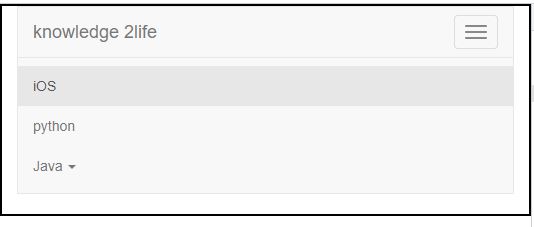
Responsive Navbar
To make the navbar more responsive, wrap the content that you want to collapse in a div with the classes.collapse and.navbar-collapse. The collapsing effect is triggered by a button with the class of.navbar-toggle and two data- elements. The first, data-toggle, instructs JavaScript on how to handle the button, while the second, data-target, specifies which element to toggle. Then, using the.icon-bar class, make what we like to call the hamburger button. This will turn on or off the elements in the.nav-collapse div>. The Bootstrap Collapse Plugin is required for this functionality to work.
This is demonstrated in the following example:
<div class="container">
<nav class = "navbar navbar-default" role = "navigation">
<div class = "navbar-header">
<button type = "button" class = "navbar-toggle"
data-toggle = "collapse" data-target = "#example-navbar-collapse">
<span class = "sr-only">Toggle navigation</span>
<span class = "icon-bar"></span>
<span class = "icon-bar"></span>
<span class = "icon-bar"></span>
</button>
<a class = "navbar-brand" href = "#">knowledge 2life</a>
</div>
<div class = "collapse navbar-collapse" id = "example-navbar-collapse">
<ul class = "nav navbar-nav">
<li class = "active"><a href = "#">iOS</a></li>
<li><a href = "#">python</a></li>
<li class = "dropdown">
<a href = "#" class = "dropdown-toggle" data-toggle = "dropdown">
Java
<b class = "caret"></b>
</a>
<ul class = "dropdown-menu">
<li><a href = "#">jmeter</a></li>
<li><a href = "#">EJB</a></li>
<li><a href = "#">Jasper Report</a></li>
<li class = "divider"></li>
<li><a href = "#">Separated link</a></li>
</ul>
</li>
</ul>
</div>
</nav>
</div>
OUTPUT :


