Labels and badges
Bootstrap labels are covered in this chapter. Labels are useful for providing page counts, tips, and other information.
To display labels, use the class.label, as seen in the sample below.
<h1>Example Heading <span class = "label label-default">Label</span></h1>
<h2>Example Heading <span class =" label label-default">Label</span></h2>
<h3>Example Heading <span class = "label label-default">Label</span></h3>
<h4>Example Heading <span class = "label label-default">Label</span></h4>
As illustrated in the following example, you may change the design of labels by utilising modifier classes like label-default,
label-primary, label-success, label-info, label-warning, and label-danger.
<span class = "label label-default">Default Label</span>
<span class = "label label-primary">Primary Label</span>
<span class = "label label-success">Success Label</span>
<span class = "label label-info">Info Label</span>
<span class = "label label-warning">Warning Label</span>
<span class = "label label-danger">Danger Label</span>
OUTPUT :

The topic of Bootstrap badges will be discussed in this chapter.
Badges are identical to labels, with the exception that they have more rounded corners.
Badges are typically used to draw attention to new or unread content.
Simply add span class = "badge"> to links, Bootstrap navs, and other elements to use badges.
This is demonstrated in the following example:
a href="#">a href="#">a href="#">a h
a>Mailbox 50/span>span class = "badge">span class = "badge">span class = "badge">span class = "badge">span class = "badge
If there are no new or unread things, badges will simply collapse using CSS's:empty selector, as long as there is no content with them.
n.
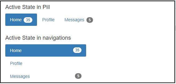
Active Nav States
In the active states of pill and list navigations, badges can be placed.
You may do this by adding a span class = "badge"> to active links, as seen in the example below.
<div class="container">
<h4>Active State in Pill </h4>
<ul class = "nav nav-pills">
<li class = "active"><a href = "#">Home <span class ="badge">35</span></a></li>
<li><a href = "#">Profile</a></li>
<li><a href = "#">Messages <span class = "badge">5</span></a></li>
</ul>
<br>
<h4>Active State in navigations</h4>
<ul class = "nav nav-pills nav-stacked" style = "max-width: 260px;">
<li class = "active">
<a href = "#">
<span class = "badge pull-right">35</span>
Home
</a>
</li>
<li><a href = "#">Profile</a></li>
<li>
<a href = "#">
<span class = "badge pull-right">5</span>
Messages
</a>
</li>
</ul></div>
OUTPUT :


